A useful tool for determining the production date of your guitar is the style of logo used. Also, cross reference this information with Headstock Styles
Note: old logos were often used right alongside new ones, so these are just general guidelines.
Note: all Mother of Pearl logos are inlaid by hand, and therefore feature some variation from one example to the next.
Samick[]
Tree Notes[]
Samick's first logo used on home brand guitars consisted of three trees with musical notes as the trunks, in a circle:
This was in use roughly from 1972-1986.
Badge[]
Around 1980, a new logo appeared, which we'll call the "Badge" logo:
This logo was used for a short time, until about 1984.
Comic[]
Around 1985, another new logo appeared, which we'll call the "Comic" logo because of it's cartoonish font:
This was used until 1988.
First Runner[]
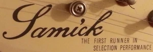
First appearing on Japanese market models around 1985 was a new script logo with the tagline "The First Runner in Selection Performance".
Script[]
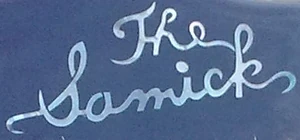
Around the same time, they introduced their "Script" logo (exclusively for the Japanese market), first as "The Samick":
Around 1987, it began appearing as just "Samick" on some models, while others still used "The Samick".
There appears to be no difference between models which use one or the other. "The Samick" was phased out by 1989. This logo was in use until 1994, when the Japanese market exclusive models were phased out.
First Runner (Version 2)[]
Around 1987, the "First Runner" logo was refined and used on models in all markets:
Vantage[]
In 1988, we first see a logo clearly using the same font style as the logo for Vantage guitars (formerly owned and produced by Matsumoku, now bought and produced by Samick):
This logo was used only until 1989. On some Japanese market models, just the "S" from this logo was used until 1994:
Spaghetti[]
Around 1989, they introduced a new logo for Fender copies, in the style of Fender's famous "Spaghetti" logo:
This lasted until about 1992.
Wave[]
In 1989, Samick introduced what we'll call the "Wave" logo:
This was used until 1994. Models with the logo inlaid in Mother of Pearl originally used this version (Notice the individual parts that make up the wave):
In late-1990, it was refined to a single piece:
Artist S[]
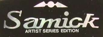
Early Artist Series models produced in 1994 featured this logo (for 6-inline style headstocks):
Artist Wave[]
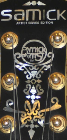
With the official introduction of the Artist Series in 1995, came a new (6-inline) version of the Artist logo, incorporating the Wave design:
This logo was only used through 1996.
Standard[]
From 1995-1996, the few Korean-made, non-Artist Series, non-Valley Arts models used this logo:
However, it was also used widely on Indonesian models.
Artist[]
Artist Series 3x3 style headstocks used this logo from 1995-1996:
Artist (Version 2)[]
In 1997, the Artist logo was refined with a new font:
This was used until 2001
Artist (6-inline)[]
Also in 1997, 6-inline headstocks got a new logo, adding "Established 1958" for the first time:
Early examples did not include the Arrow/Guitar outline. This was used until 2001.
Note: Indonesian Samicks used the same logo, just without the small "Artist Series" text, making them easy to mistake for a Korean model.
S[]
Beginning in 1998, a new logo appeared, mostly on new original designs:
Sometimes, mostly on basses, it was incorporated into an abalone circle:
Hondo[]
Psychedelic[]
Hondo's first logo debuted in 1972 with a psychedelic, '60s style font:
This was used until about 1976.
Block[]
The next logo came shortly after the name change to "Hondo II" (acoustics can be found with the Psychedelic logo followed by "II" on the inside label) around 1976, now in a block font:
This was used through 1977.
Script[]
The classic Hondo II script logo was first used in March 1977. [1] The first version connected the "o" to the "n" at the bottom, making it look like "Hando II":
This was corrected by early 1979, and the logo was used until 1981.
Note: this logo re-appeared on later Hondo reissues which were not made by Samick.
Sunrise[]
In 1981, a new logo appeared, with an "H" in a circle, resembling a rising sun:
This logo was used until 1989.
Note: this logo re-appeared on later Hondo reissues, which were not made by Samick.
Deluxe Series[]
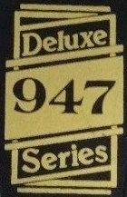
In 1982, some 3x3 style Deluxe Series models did not include a Hondo logo at all, just the Deluxe Series logo in the center of the headstock:
By 1983, it had moved to the truss rod cover and the Sunrise logo was always included.
Fame Spaghetti[]
In January 1984, the Fame Series was introduced as a line of Fender copies with stock Grover tuners. Fittingly, the Fame logo was done in Fender's classic "Spaghetti" style:
This logo was last used October 30, 1985.[2]
Fame Broadway[]
For 1986, the Fame Series logo was changed to the "Broadway Engraved" font:
This was used through 1988.
Martin[]
Around 1985, Hondo began using a logo in the style of Martin Guitars':
It was used mostly on acoustics, but also a few electrics, like the H-935.
Marker[]
In 1988, a new logo appeared with a thick script font, so we'll call it the "Marker" logo:
This was the last logo used on Samick-built Hondos. However, it was also used in the early '90s on Hondos not made by Samick.

